Paul Cezanne
Paul Cezanne was a French painter who specialised in post impressionism where the aims of the movement were to challenge the excepted concept of colour and light and he worked in still life. He studied in Paris and his early works were rough and ‘crude’ therefore he was rejected by exhibitions in 1863. From 1871 he began work with Pissarro and in 1874 and 1876 he had work in the impressionist exhibition. From then on he worked in province with light and dark foliage. He was influenced by Renoir, Monet and Pissarro.
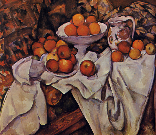
In the picture below ‘Still life with fruit and pitcher’, he has created a scratchy appearance in the background and the marks are very detailed especially in the use of material. To some extent you can see some brush marks mainly on the darker colours. For the white tablecloth, he has used many different colours because of the light and the dark areas such as the yellows, blues, green and orange, although, all these colours have created a successful noticeable white tablecloth. Because he has used plenty of texture, tones and detail, he has created an effect of the material. Cezanne has made it look as though every mark has been done for a purpose since it all works really well together .The painting has a couple of angular parts, mainly, the material and on the table. The objects in the painting like the jug, bowel and apples are all crowded together in the same section.
For the background he has used darker warm colours like red, orange and browns although as the painting continues, the colours begin to lighten up a little but still mix to create yellows/crème mixed with black and blues in the right top corner. He has made the background very busy and made it out to look a rough wooden texture. The tonal range is more limited than some of his paintings and he has made it out that the colours are more neutral and don’t jump out of the page. I think that colours are used really well such as in the bottom right corner he has used brown for the leg and to tell that he has separated it from the rest of the table has made the sides of the legs darker and to show another side of the leg made it a lighter colour which looks pink.